Animal Kingdom - Experiment blog
Figure 1. Harvard Oxford Masks
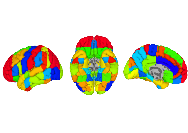
Figure 1. All Harvard-Oxford masks. Colors are randomized to best how the boundaries of each region. Note that just because two regions may have similar colors, they are not related. A region is defined as a continuous area of the same color. Here lingual gyrus is split into anterior (Ling-A, blue) and posterior (yellow). This figure needs to have labels for each mask
<Click back to top>
Figure 2. Cross-Subject Similarity Correlation

Figure 2. The average similarity structure correlation across subjects for each region. The map only shows regions where the average similarity correlation was above r = .30. All images below are on the same scale, where green = 0, Red = 1.0.
<Click back to top>
Figure 3. Classification Accuracy
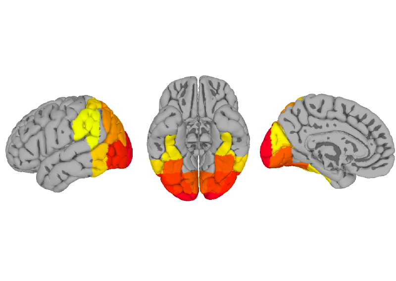
Figure 3. The average (across subjects) classification accuracy for SVM 6-way classification. Only accuracy > .30 shown.
<Click back to top>
Figure 4. Correlation with Behavioral Similarity
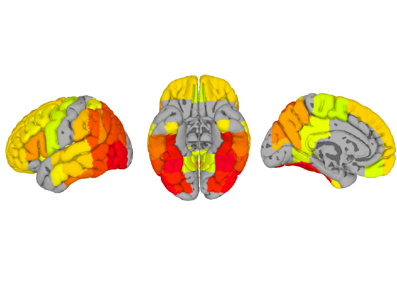
Figure 4. Correlation between behavioral similarity and the average MVP similarity per region. R > .30 shown.
<Click back to top>
Figure 5. Correlation with V1 Model
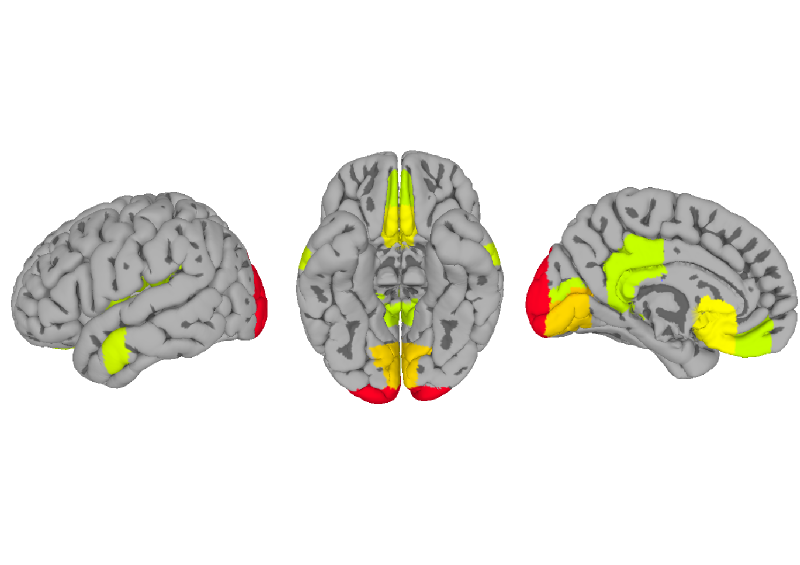
Figure 5. Correlation between V1 model similarity and the average MVP similarity per region. R > .30 shown.
<Click back to top>